

How We Built a Branded Merch Package: Screen Printing Techniques
BY LON WINTERS – Connect with Graphic Elephants
Creating a unique branded merch package using screen printing requires a little creativity, out-of-the-box thinking, and some good old-fashioned technical application. Following is a picture tutorial on how we elevated the Branding Together logo into a textured, eye-catching screen print.
Note how the little, extra details tell the brand story in an even more meaningful way.
Step 1: Art Creation

All images courtesy Lon Winters
Our first step was to take the Branding Together logo since it was vector and pull it into Adobe Illustrator. There, we added some fun touches to the background circles. We also edited the actual words “Branding Together” so that when it was time to print, they would really pop with some cool effects.
We decided to add a nifty touch we like to refer to as an “underbelly” print.
Step 2: Screen Making
 It was time to make the screen. We used a computer-to-screen (CTS) printer, which does differ from traditional film processing. You can, of course, follow the traditional stencil process. Here are some basic steps to follow for CTS:
- Create your design and separate each color into its own layer.
- Use a design program like Adobe Illustrator to clean up the file and ensure each color is a spot color.
- In the design software, set up the print order and attributes, and save your file in the correct format for the CTS machine.
- Load your coated screen into the CTS machine’s registration system.
- Use the RIP software to send your artwork file to the CTS printer.
- The CTS machine will print your design directly onto the emulsion on the screen.
- Some CTS systems have this exposure unit built-in, while others require a separate exposure unit.
After exposure, rinse the screen with water.
Step 3: Ink and Color Matching
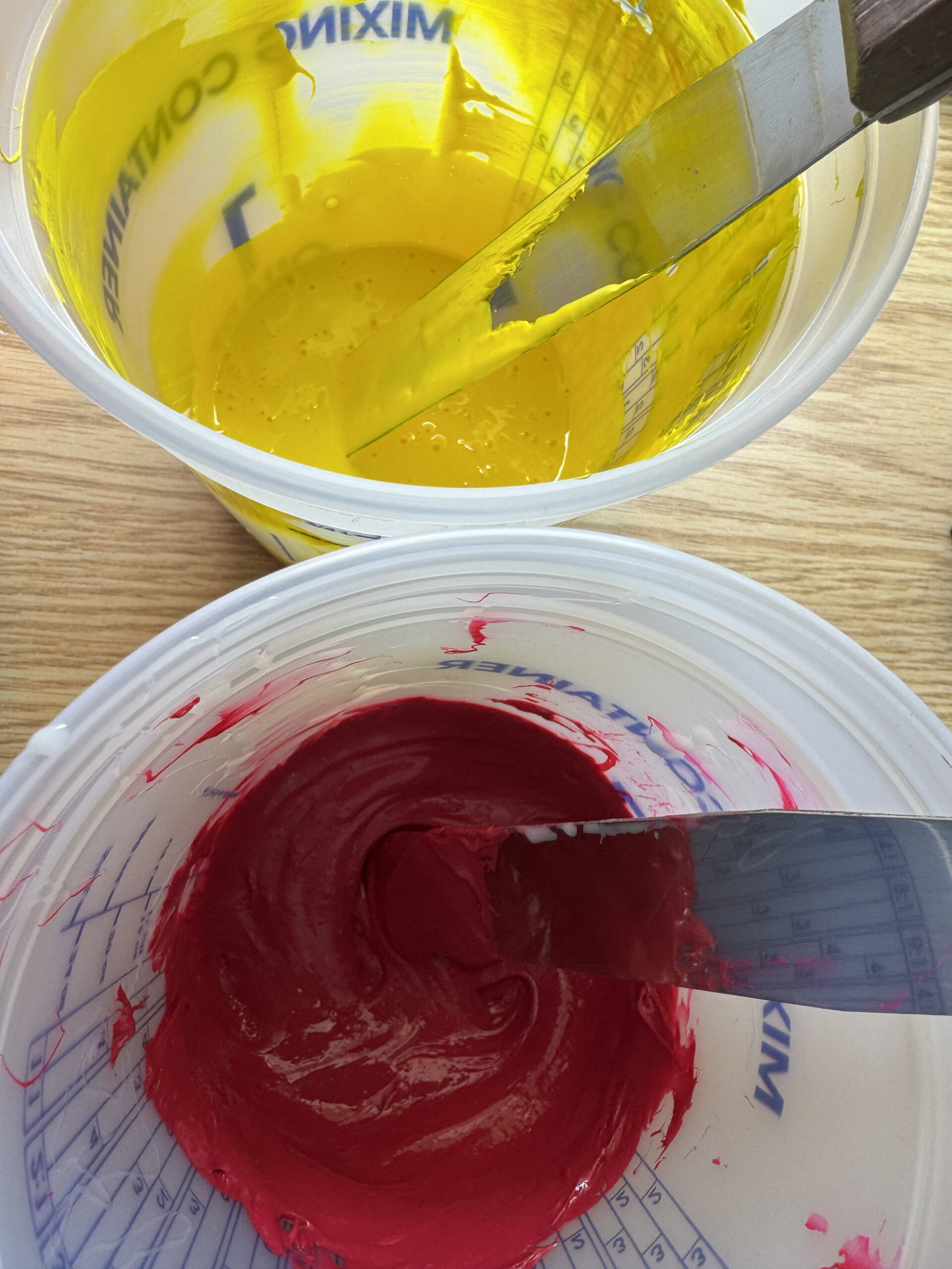 Next up, mixing the ink. The spirit of the logo is CMYK, so we mixed a magenta and yellow but with a transparent version. We took those and reduced them about 75% so that when printed directly on black, we get a lot of show-through. Same with the gray ink on the underbelly and the label.
Step 4: Time to Print
4a. The first location we will outline for printing is the neck label. This is the perfect area to add a bit of your own branding. We loaded the shirts onto our smaller platen and did a manual press using a basic gray ink for this spot.
We used exceptionally light pressure to print.
4b. Next up, it was time for our “underbelly.” This is a special location that’s on the inside of the garment just above the bottom hem. A couple things to note: Make sure the art and screen are set up properly—when the wearer lifts the garment, anyone looking at it should be able to read the words.
From there, repeat the process from step 4a.
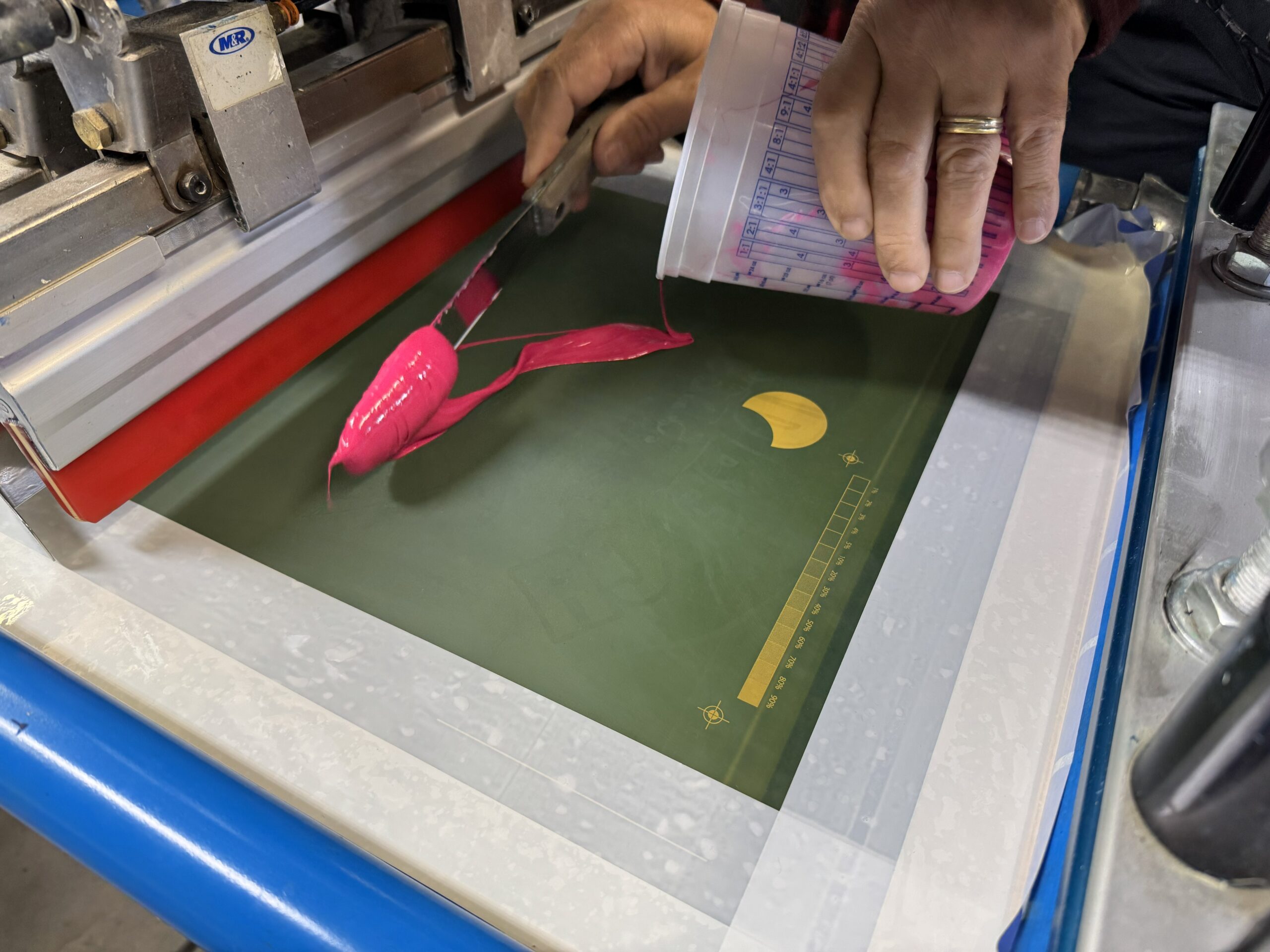
4c. And finally, the more traditional print placements — upper back and front. While less utilized, the upper back print serves as an eye-catching way to incorporate one part or color of the logo and really tie together the brand story. For this print, we simply took the two circles and executed them as a halftone print.
-
- Neck label.
-
- Underbelly print.
-
- Upper back printing.
For both of these, we used the auto press. We were trying to match the front with that transparent look. Super high mesh that allowed for a transparent print that allowed the shirt to show through.
We replicated the halftone circles for the front of the garment as well, but offset them a bit so we could print as big as possible. We did a 25 LPI halftone so you can visually pick it up.
Then, it was time to add the “Branding Together” text. Notice the textural effect we achieved using a high-density clear with a gloss look to it. We used a thicker stencil for the dimensional effect. In order to achieve the next step, do not fully cure this print.
Step 5: Foil Application
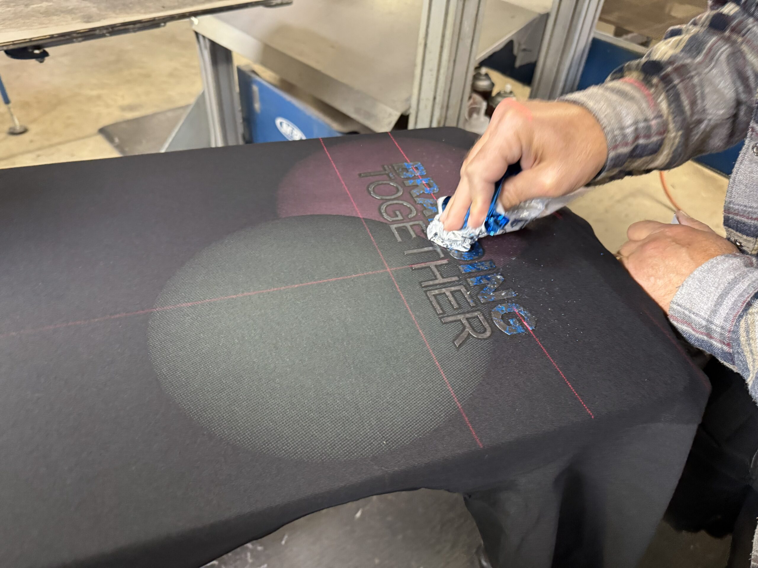 How can you elevate the screen-printing process even further? Add some shine! The high-density clear ink has a great adhesive quality when it’s very hot. We grabbed some foil and very lightly rubbed it over the Branding Together print. Even though we used the same technique, it leads to a different look on each letter. For this print, we used two foil colors, a magenta/gold and cyan/silver combination.
Next, run the garment through the dryer for its last cure. When it goes through the dryer, it needs to be hotter than typical. This increases the durability of the foil so it doesn’t tarnish or wash off.
Step 6: Final Touches
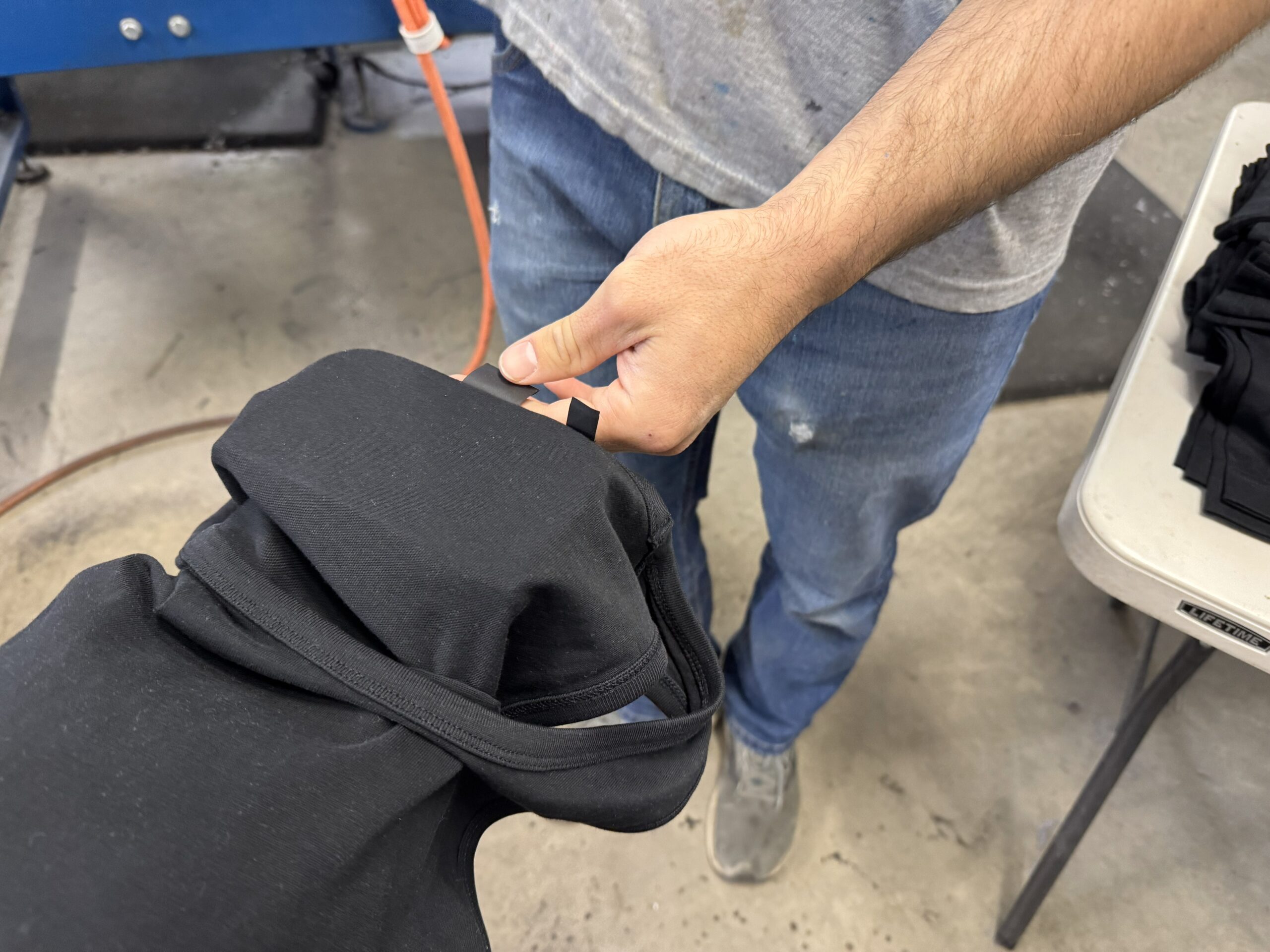
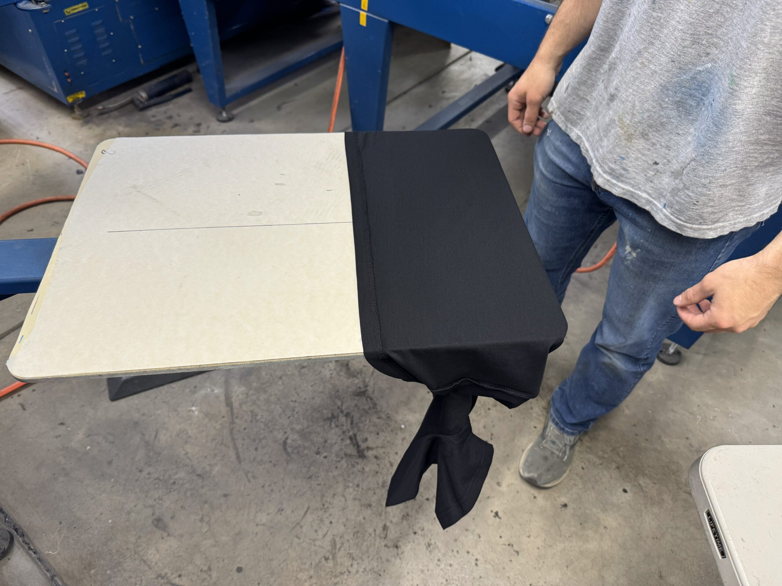
![]() Branding should always be on your mind — your message and marketing is important. So we decided to add a little finishing touch: a small leather heat transfer to the sleeve with the Graphics Elephant logo. We ordered this from Deco Press, but you can explore other options for patches.
Branding should always be on your mind — your message and marketing is important. So we decided to add a little finishing touch: a small leather heat transfer to the sleeve with the Graphics Elephant logo. We ordered this from Deco Press, but you can explore other options for patches.
We slipped the shirt onto our sleeve platen, covered with a Teflon pad, and pressed it.


