

Holy Grail Design Tips for Digital Printing
As apparel decoration continues its voyage into the digital world, Apparelist wants to make sure everything is smooth sailing. When it comes to digital printing, it’s a matter of intersection of color, fabric, and print technology to create pieces that don’t just look good on screen but sell off the rack — or if we want to stick to the nautical theme here, off the aft deck.
Like we always do, we’ve got you covered. Industry experts Michelle Moxley, an automation and AI consultant, and Dane Clement, vice president of Art and Creative Process for GroupeSTAHL, weighed in to give their “must-know” design tips for digital printing.
It All Starts with the Printing Method
If you ask Clement, he’ll tell you that one of things you need to start with before anything is determining whether you’re using DTG or DTF printing.
Ultimately, his philosophy is simple: Create compelling artwork first, then adapt it for the chosen print method, while keeping production realities — and client expectations — in mind.
“It matters; DTG for instance, it can only go on cotton,” Clement says. “So, you get that very limited space, but you got a lot more leeway because you can print more solid areas, and it doesn’t have that feel like a DTF would. … With DTF you don’t want to have a lot of soft edges unless you have toned them or you have a way to handle those, and you’d have more open spaces in the design because of the heavy hand it has.”
Moxley believes that when you’re designing, you shouldn’t make it with just one printing method in mind.
Initially, you don’t know how it’s going to be printed because there are a variety of factors that need to be determined with the customer, she says. “You don’t know what volume they’re going to order, and maybe you have to design it with the intention of being able to keep it within a certain [number] of colors,” Moxley adds. “It can go either digital or screen print, and that means that you’re kind of designing with the guardrails of both on. And maybe you can’t print on all the different colors [of blanks] that you want to, so you have to design with any possible outcome in mind.”
Moxley recalls a project she was working on where she proofed up full-color concepts intended for digital but wound up doing screen-printed transfers. In the end, the design could run through screen print, screen-printed transfer, and digital print.
Don’t Bottleneck Yourself
In a similar vein of designing for all applications, Moxley also believes that you need to do what’s best for the workflow of your shop.
“If you get to a point with a design that you’re like, ‘I really, really want this to have a long fade, but I really, really don’t want to press screen print volume,’ then you’re going to restrict your application to DTG,” she says. “That’s where you’re going to bottleneck yourself a little bit with a design. So instead of thinking it has to print a certain way, versus having designs that can be flexible in your factory and move to open equipment – that’s your ideal scenario.
Understand Your Substrate
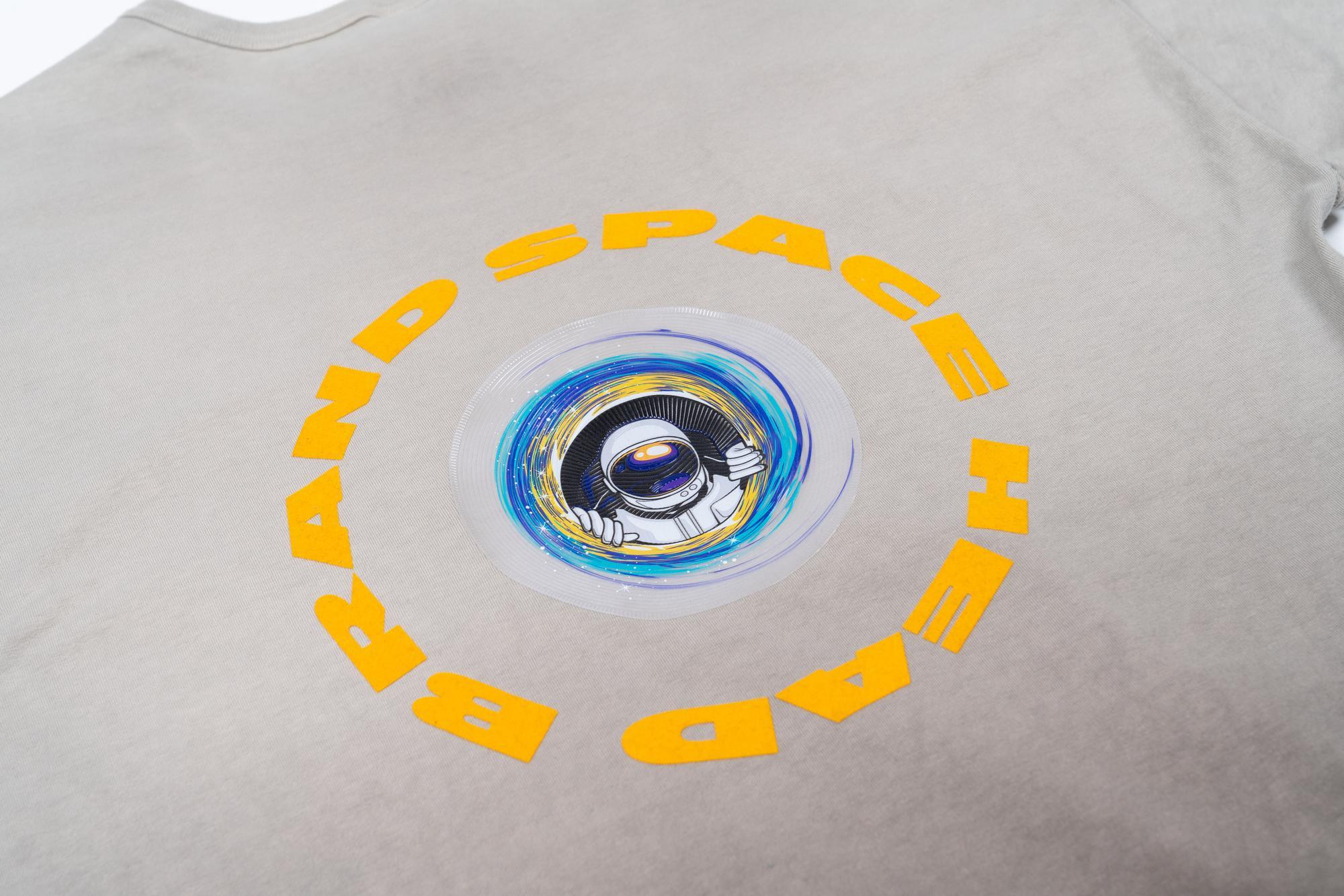
Factors like the garment color, fabric type, and even the placement matter when avoiding design bottlenecks. | Credit: STAHLS’
Just because a design may look great on a tote bag, doesn’t mean it’ll always transfer to another garment just as easily. For Moxley, one of the biggest mistakes she sees apparel decorators make is not understanding how a design may work on a different substrate.
Think different-colored backgrounds or different types of materials, for example. Assuming that if something is working on one thing means it will work on many different things isn’t always the case, Moxley says.
Clement echoes a similar sentiment and reminds us again why it’s important to also choose the right digital print method for your design. “If I’m going to DTG print [a design], then I can’t use a tri-blend or a 50/50 or any sort of cotton/poly blend because the colors just die,” Clement says. Pay attention to what fabrics you’re working with, how you’re printing them, and design accordingly.
One piece of advice Clement has for ensuring the best output on a digital design: Control the garment color.
“If you know what the garment color is going to be, then you can make adjustments to the artwork, opening up holes and open spaces,” Clement says. “Even in screen printing, if you can design for a garment color, then you can open up those areas and have a lighter hand. That’s true for any printing technique, digital as well.”
High-Res is Essential
Clement says that while with screen print you can get away with lower-res illustrations, that is definitely not the case for digital print. Moxley and Clement both agree that image resolution should be 300 or above
To achieve this, Clement says he designs in an RGB space, and while he has gotten some pushback, he’s okay with possibly losing some of the “really hot” colors when it gets printed on CMYK.
“Most people use images for more than just a shirt, right?” Clement poses. “They might create a design, but maybe they’re going to do a social ad [as well]. Maybe they want it to be on Instagram as a reel. So all these other things come into play. Can I print that? No, I can’t. But, a RIP software gets you somewhere in the ballpark.”


